The underlying price level and EmojiZone state data used for visualization can be made available programatically to your trading platform for alerts and development of sophisticated automated trading systems. Examples of trading rules that can be created for alerts or automation (depending upon the capabilities of your trading platform) are:
…sound an alert when current price is within 1 tick of the nearest New Supply or New Demand level.
…if there is Unfinished Business at the daily high: enter long when a bar’s low is no higher than 1 tick above a Price Rejector New Demand high price, the bar has not closed below the New Demand low price, current price is above the Price Rejector New Demand high price and the distance of current price to Unfinished Business price (reward) is at least 2x the distance of current price to the lower of this bar’s low and the Price Rejector New Demand low price.
Some simple platform-specific examples are provided within the Advanced Techniques & Settings section of this guide.
EmojiZone data is provided to your trading platform by setting the Populate EmojiZone Supply/Demand Data setting to Yes. The trading platform’s subgraphs, plots, etc., are then populated with EmojiZone data.
It is not necessary to have an active EmojiZone visualization mode in order to set Populate EmojiZone Supply/Demand Data to Yes. You could choose to not use an EmojiZone visualization mode and instead use the trading platform’s native subgraph, plots, etc., display capabilities to monitor EmojiZone levels, however in most cases, this will result in inferior visualization to the EmojiZone visualization modes. Different trading platforms have subgraph, plot, etc., quantity limitations such that our indicators only populate the nearest levels of data and their ability to visualize from subgraphs and plots can be less flexible or visually appealing than what the EmojiZone visualization modes deliver.
Visualization vs. Data Recommendations
We recommend using EmojiZone visualization modes for drawing graphics to make discretionary trading decisions.
We recommend using EmojiZone data through your trading platform’s subgraphs, plots, etc., for alerts and automated trading.
It is unlikely that an automated trading system that is running in a live production mode will require any visualization of levels. This graphic overhead can potentially impact performance of the automated trading system. For best performance on trading platforms using emoji indicators for automated trading, we recommend using EmojiZone data, disabling (if possible) any trading platform drawings that use this data and setting EmojiZone Visualization mode to Off.
Platform-specific information
NinjaTrader
EmojiZones have 6 possible states: New Demand, Continuing Demand, Exhausted Demand, New Supply, Continuing Supply and Exhausted Supply…
An EmojiZone may be a single price level (e.g. a Supply/Demand event caused by a Small Print or Unfinished Business) or span a range of price levels with a corresponding High Price and Low Price pair (e.g. a Supply/Demand event caused by Price Rejector).
The emoji trading Order Flow Suite for NinjaTrader provides access for the 3 nearest EmojiZones to price. This allows these price levels to be used for Alerts or Automated Strategies.
To access this data, enable Populate EmojiZone Supply/Demand Data? in the indicator parameters. You can then see these indicator values in the NinjaTrader Data Box and use them as a basis for Alerts or Automated Strategies.
Sierra Chart
A single Sierra Chart custom study provide 60 subgraphs…
…EmojiZones have 6 possible states: New Demand, Continuing Demand, Exhausted Demand, New Supply, Continuing Supply and Exhausted Supply…
…an EmojiZone may be a single price level (e.g. a Supply/Demand event caused by a Small Print or Unfinished Business) or span a range of price levels with a corresponding High Price and Low Price pair (e.g. a Supply/Demand event caused by Price Rejector).
You can appreciate that 6 EmojiZone states x 2 EmojiZone price levels (high price and low price) = 12 subgraphs of the available 60!
Taking this into consideration, the emoji trading Order Flow Suite for Sierra Chart provides subgraphs for the 3 nearest EmojiZones to price (36 subgraphs for indicators that need to accommodate High Price and Low Price pairs; 18 subgraphs for indicators that only need to accommodate a single EmojiZone price level). This leaves sufficient free subgraphs for the indicators to also provide condition states, symbols and additional calculation data. Each indicator’s subgraphs are described within the Indicator Reference section of this guide.
EDGE Zones™
Note that the EDGE Zones indicator can be used to identify Aggression across a single price level or multiple price levels (a stacked imbalance), therefore it provides High Price and Low Price subgraphs for each EmojiZone. When EDGE Zones is being used to identify a single price level, the High Price and Low Price subgraphs for each EmojiZone will hold the same data.
Subgraph Draw Styles
In general, we do not recommend using the subgraphs for visualization. The graphics drawn using the EmojiZone visualization modes have better appearance than those created using Sierra Chart subgraph Draw Styles and only the 3 nearest EmojiZones to the current price will be drawn. The intended use of the subgraphs is for alerts and automated trading and for best performance in these use cases, we recommend using a Draw Style of Ignore. Alternatively, you can consider setting the Draw Style to Subgraph Name and Value Labels Only. This allows name labels to be placed on the chart, e.g. “ZP” for zero print, at the relevant price levels.
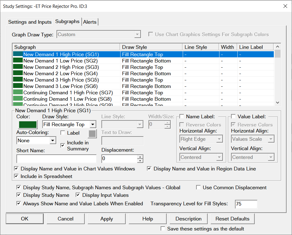
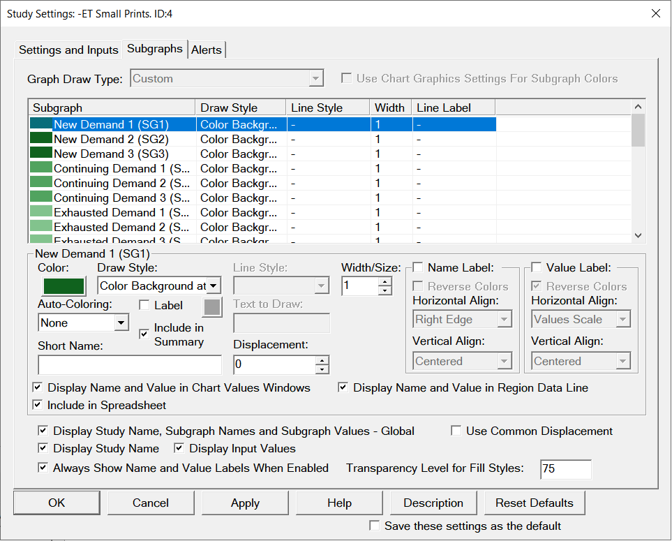
When using the subgraphs for alerts or automated trading, you may wish them to be visible for testing and validation purposes. In this case we recommend setting the following Draw Styles:
High Price/Low Price subgraph pairs: Fill Rectangle Top (and Fill Rectangle Bottom).
Single subgraph price levels: Color Background at Price.
If you set High Price/Low Price subgraph pairs to a Draw Style of Color Background at Price, the area between the high and low prices will not be colored which can be potentially confusing if you have multiple or overlapping levels on the same chart.